Written by Selene M. Bowlby

There are a lot of details to consider when designing and developing a web site. In reality, it can seem like an endless list – but if you look carefully you’ll see that there are certain elements that are more important than others, elements that are used consistently among the most successful sites.
Once you’ve completed the Planning Stage of your website, the rest of the elements fall into broad categories ranging from User Interface Design to Content Creation to actual Development. Of course, there are also the issues surrounding Search Engine Optimization (SEO) – but we’ll save that for another day…
With that in mind, here are the 15 elements that should always be included on any top web site.
1. Good Visual Design
First things first… Visual design. I don’t know about you, but if I go to a web site that is not visually pleasing, it is a quick turn off.
That’s not to say that every top website needs an incredible visual design – but if a site looks like it hasn’t been updated since 1994, it’s just not going to be associated with other great websites.
A clean and simple design is usually all you need. Bells and whistles are nice, but I’m one who tends to go with the “less is more” theory. You don’t want your design to be over crowded. You just want it to look good so it can stand out from your competitor(s) in the minds of your potential clients.
First impressions are key. Although good design alone will not keep someone on your site – an eye-catching design will, at the very least, grab their attention long enough to take a look around.
2. Thoughtful User Interface
 Along with good design comes a good user interface. The user interface is the foundation of any good functional web site. When designing a site, you’ll need to take into consideration your average user. Who is going to be visiting your web site – who is your ideal customer? Are they tech-savy? Are they computer illiterate?
It’s helpful to create an image of your ideal visitor and have them in mind when planning out the design for your site. Be sure you offer everything on your site that they would want to find before buying from you or becoming a subscriber.
You’ll want to be sure that your navigation is easy to spot and consistent throughout the entire web site. Make it obvious where the user should click both in terms of your primary navigation, as well as for links within your content areas.
3. Primary Navigation Above The Fold
Part of having an easy to navigate web site is ensuring that the primary means of navigation – links to the key areas of your site – are kept above the fold. With today’s large computer monitors and growing screen resolutions “above the fold” is generally considered to be within the top 500-600 pixels of your site design.
Elements to include here are your logo (which should link back to your home page), as well as links to the main sections of your site. If you can link to sub-pages here that is great, but in most cases that will over-clutter your design.
For example put “Home | About | Services | FAQ | Contact” in a very easy to find location at the top of your site. You can place sub-links such as About-Bio / About-Resume somewhere else, such as in your sidebar or as sub-links under the main page title of that section, etc.
Consistency is key here – be sure to place both your primary and sub-navigational links in the same spot throughout the various pages of your web site.
4. Repeat Navigation In The Footer
If you use images (or even flash) for your main navigation, it’s especially important to offer a duplicate set of navigation links in your footer. Even if you use text links at the top, the duplication is still helpful. You want to make it as easy as possible for people to find the content they are looking for on your site.
Often times the footer will link to additional information – such as Terms of Service – as well. Things that should be easy to find, but not necessarily something you want taking up real estate on the primary navigation area of the site.

5. Meaningful Content
You know the saying… “Content is King” – you might have a pretty web site which will catch someone’s eye, but if the content is no good, you can be willing to bet that they aren’t going to stick around.
When writing the copy for your web site, it’s important to provide helpful, knowledgeable information about your company, products, services, etc. If you’re running a blog, informative articles related to your area of expertise are incredibly helpful as well.
While it’s important to sell yourself or your company, you also don’t want to oversell, either. Particularly in a blog setting – people reading a blog don’t want to hear all about “me me me” – they want to know how you can help them.
6. A Solid About Page
Among the top 10 most popular pages of my own site (after the home page, blog, 3 specific blog posts and my portfolio) is the About page. I have more clicks to my about page than to my services or portfolio pages, if you can believe that!
It’s simply because people are curious. They want to know who is behind a company or a blog. I was personally quite shy about including a photo on my own bio page, but finally did it a few months ago. It’s amazing what the sense of curiosity does – I myself am always clicking on about pages too, trying to find out more about the designer or writer, etc.
Include information on your background and how it pertains to your own business and expertise, etc. The about page gives potential clients a little bit more information about you and can often help create a more personal bond. If they are reading your writing and know a bit more about you, they’ll have a better sense of connection and better be able to relate to you on another level.
More often than not, a potential client will select the company with a “real” person behind it, rather than the faceless organization that refuses to get even a little bit personal.
7. Contact Information
 Nothing can turn off a prospective client more than not being able to find a way to contact you. If they’re interested in your services, and can’t find a simple contact page with a way to get in touch and hire you they’re going to end up going over to the competition.
Ideally you’ll want to give more than one method of contact. At the very least an email address and contact form. To make you more “real” though you should try to include a phone number (and if possible a mailing address) as well. I know many freelancers work from a home office – as do I. A quick solution is to get a separate phone line for business calls, as well as either a PO Box or other mailing service address.
Keep in mind that these are tax deductible expenses and makes you look that much more professional than someone who only includes an email address. To other home business owners in the same boat, it might not make a difference. But if you work with any larger or corporate clients, they’ll see a public phone number and address as an added sign of stability and that could play a small part in them choosing you over someone else.
8. Search
If you have a large web site or blog, having a search field is incredibly helpful, as well. There’s nothing like wading through hundreds of pages to find specific content without a search feature. If a potential customer can’t find something easily on your site, but Joe Designer over there does… odds are they are going to go with Joe whose content is easy to search through.
You can often use a Google Search on your site, or if you have WordPress (or another blogging platform or CMS / Content Management System) this will be fairly easy to accomplish. It’s not quite as easy to set this up with a static html site, but there are still services out there that will let you incorporate a functional search box onto your site.
9. Sign-Up / Subscribe
 If your web site offers content on a consistent basis – such as with a blog – you’ll want to make it as easy as possible for people to sign up for updates.
This is something else that’s extremely easy to add if you have a WordPress blog. By default they’ll provide you with a feed address. But if you want to step it up a notch, you’ll want to sign up for a free account with FeedBurner. Better yet, you might consider using the FeedBurner FeedSmith plugin that will help re-direct all feeds through your FeedBurner account for easy tracking of your subscribers.
If you don’t have a blog, but still want to offer subscriptions to an email newsletter, for example, there are many companies that will let you setup and manage a mailing list. They will provide you code for your site to enable your web site visitors to sign up for updates using their email address. (FeedBurner allows you to collect email addresses too, btw). In some ways this is better than an RSS subscription because you are able to collect email addresses of potential prospects. While you can keep track of subscription numbers and other generic statistics, RSS subscribers get your updates via feed reader and have no need to provide an email address.
10. Sitemap
There are two kinds of sitemaps – one for humans and one for the search engines. An html (or php, etc.) sitemap meant for visitors to your site can be an invaluable tool for finding just what they are looking for.
Creating a sitemap – a structured list of all pages of a web site – is especially useful if you are unable to add a search feature to your site. A link to the sitemap is another item that is helpful to place down in the footer of your site, as well. A good sitemap will list out every page of your site in a hierarchial format – clearly showing the relationship of pages in terms of primary pages with sub-pages and sub-sub-pages, etc.
11. Separate Design from Content
Long gone are the days of using html tables for layout and design. The best developed sites use a combination of XHTML and CSS (Cascading Style Sheets), which create a separation of design vs content.
With use of <div> tags you can create containers for various areas of text and images on your page. Without a corresponding CSS file you’ll see just the basics – text – which is what the search engines want to see, too.
By linking to an external CSS file in order to separate your content from the design, it leaves your html page with mostly nothing but actual relevant text in your source code. The separate CSS file is what specifies the fonts, colors, background images, etc. for your site design.
What’s great about this is you can update just one CSS file and have the change made site-wide (no longer having to go into each and every html page of a static site, to change your main link color from blue to green, for example).
With this separation of content from design, the search engines no longer have to wade through all of the excess code to find out if your content is relevant, either. And with separate files, the content can load quicker, too – always a good thing in the mind of visitors to your site.
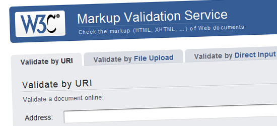
12. Valid XHTML / CSS
It’s not just enough to develop your site using XHTML and CSS, though. It has to be accurate code. Two invaluable tools for checking your source code are offered by the World Wide Web Consortium (W3C):
There are many reasons to write valid code… With valid code, you are a few steps closer to ensuring your site will look good across the different web browsers (see number 13 below) and will help you with the search engines, too. If your site is built to current web standards, the search engines can easily wade through your content.
Not to mention it just shows that you know what you are doing. Yes, many clients don’t know the difference, but a few do – and specifically request standards compliant code. If you can offer this but your competitor can’t – that gives you an extra edge.
And besides this, other web developers are likely to check out the source code of a site to see what’s under the hood… both out of sheer curiosity, and just because they can!
13. Cross Browser Compatibility
Although you might live and breathe inside Firefox, your client may not. There’s a good chance your client is using Internet Explorer. Unfortunately there’s an even better chance they’re using Internet Explorer 6 (please don’t get me started on this issue – lets just say I know I’m not the only web developer who wishes this browser will simply GO AWAY!)
It’s imporant that your own web site and the site(s) you create for customers display well in as many of the mainstream web browsers as possible. If you can make them compatible across platforms too, that’s ideal. Most end users are on a PC so this is probably the most important platform to target. However many people in the creative fields are on a Mac, so if this is your audience they are important to pay attention to as well.
Unfortunately most people aren’t lucky enough to have both a PC and a Mac (not to mention Linux, etc.) but with the help of a site called Browser Shots you can enter a URL – select from a variety of web browsers across different platforms – and have them create screenshots for you. Very helpful if you’re on a PC running Vista for example, where you no longer have access to an old copy of IE6.
14. Web Optimized Images
When designing for the web, it’s important that you save all your images in a compressed format. Not too much that your images become pixelated, but as much as possible while retaining quality.
If you’re accustomed to doing print work, you know that 300dpi is the standard. Not the case with web sites, though. When designing for the screen you’ll want to save your images at 72dpi which will make for a much smaller file size (aka quicker download time for your web visitors).
Programs like Adobe Photoshop have a “Save for Web” feature that will automatically convert your image to 72dpi if you forgot, as well as give you a variety of compression settings when saving your imges. For web this will likely be either png, jpg or gif depending on the particular usage.
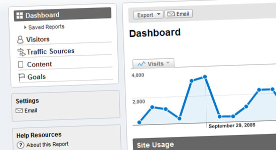
15. Statistics, Tracking and Analytics
Although this element is behind the scenes and not one you’re likely to know about as the web visitor – as a web site owner it is crucial, if not down-right addictive!
There are many services that offer tracking of web site statistics which include information such as:
- How many hits does my site receive?
- How many of these are from unique visitors?
- How are people finding my web site?
- What search terms are they finding me under?
- What web sites link to me?
- What are the most popular pages on my site?
- Who is my average visitor (platform / browser / screen resolution)?
It’s actually quite amazing what kind of information you can keep track of with a good analytics program. Perhaps the most popular site for this is Google Analytics which offer a very robust (and free) tracking solution.
If you want to monitor your web site’s performance and figure out how you can improve your site, having a good stats package is key!
Now It’s Your Turn… What Do You Find Most Important?
As far as design, development and content (we’ll cover SEO in a separate post) what elements do you consider the most important feature for a web site to have? What do you see as a deal breaker if a company does NOT have on their site?
I’m sure there are more than the 15 elements listed in this post – so what else would you add to the list? Please share in the comments below!
Image credits: Gaetan Lee, minor9th, ?lex, michael hilton, Chesi – Fotos CC
 Google introduced the beta version of its open source Chrome browser nearly two months ago, and issued its third update to the beta yesterday. (The update pushes to you automatically if you’re running Chrome.) Although there are signs that the very early popularity of this browser has calmed down somewhat, it’s still generating a lot of buzz, Google has confirmed that many extensions are coming for it, and I expect to see it in a mobile version very soon. If you’re running Chrome, here are seven tips for customizing and getting the most out of it.
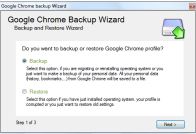 Create and Save Profiles. Google Chrome Backup is a freely downloadable tool that lets you backup and restore profiles you’ve created in Chrome. It’s wizard-driven, to keep the process easy.
 Run Chrome on Mac OS X and Linux. CrossOver Chromium from CodeWeavers can be used to run Chrome on Mac OS X and Linux. You’ll find downloads specific to most popular Linux distros. Even CodeWeavers describes this as early “proof-of-concept” more than anything else, but you may want to give it a try.
![]() Use the About: Pages. Like Firefox, Google Chrome can pull up a ton of useful diagnostic and other types of information if you type about: commands in Chrome’s address bar. For example, type about:plugins to get the list of plugins available for Chrome. The Google operating system blog has a good list of these.
Use the About: Pages. Like Firefox, Google Chrome can pull up a ton of useful diagnostic and other types of information if you type about: commands in Chrome’s address bar. For example, type about:plugins to get the list of plugins available for Chrome. The Google operating system blog has a good list of these. Here’s a Video Featuring 10 Chrome Basics. In case you missed any.
 Along with good design comes a good user interface. The user interface is the foundation of any good functional web site. When designing a site, you’ll need to take into consideration your average user. Who is going to be visiting your web site – who is your ideal customer? Are they tech-savy? Are they computer illiterate?
 Nothing can turn off a prospective client more than not being able to find a way to contact you. If they’re interested in your services, and can’t find a simple contact page with a way to get in touch and hire you they’re going to end up going over to the competition.
 If your web site offers content on a consistent basis – such as with a blog – you’ll want to make it as easy as possible for people to sign up for updates.







 Capitalism is collapsing, we’re eating shoes for dinner and our houses are worth about 10p – so it’s more important than ever to ensure that we’re getting the biggest bang for our bucks.
