Collected by telegraph
Remember the days when the word Google was not interchangeable with internet? Or when every site seemed to have a Netscape icon on it? Or when Flash was still something you cleaned your floor with? Then you were clearly using the web in the mid to late 1990s when pages were rudimentary affairs containing lists of links and information.
Thanks to the waybackmachine internet archive, we’re still able to see some of the Web 1.0 and Web 2.0 pioneers looked in their earliest incarnations.
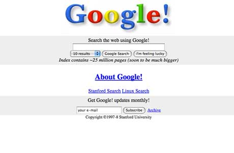
1. google.com – launched in 1996
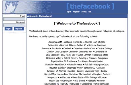
2. facebook.com – launched in 2004
3. myspace.com – launched in 2003

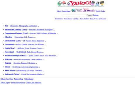
4. yahoo.com – launched in 1994
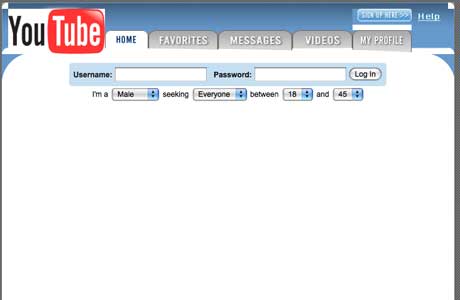
5. youtube.com – launched in 2005
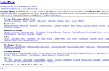
6. wikipedia.org – launched in 2001
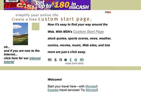
7. msn.com – launched in 1995
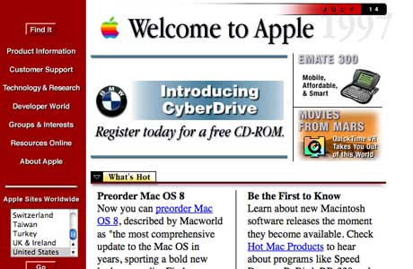
8. apple.com – launched in 1987 (screenshot from 1996)
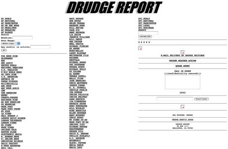
9. drudgereport.com – launched in 1997
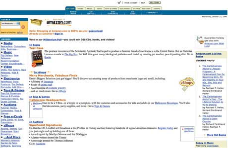
10. amazon.com – launched in 1995
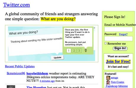
11. twitter.com – launched in 2006
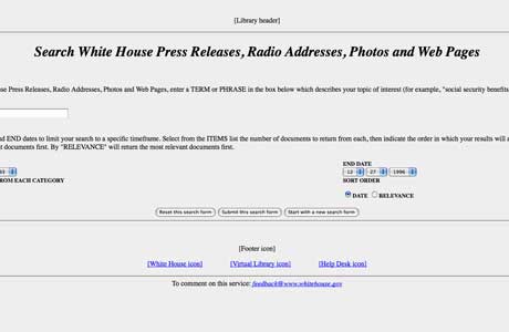
12. whitehouse.gov – launched in 1994
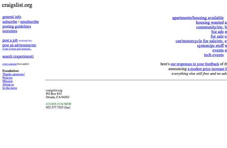
13. craigslist.org – launched in 1995
14. nytimes.com – launched in 1995

15. news.bbc.co.uk – launched in 1997

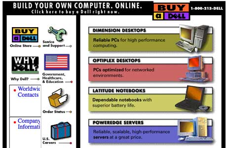
16. dell.com – launched in 1996
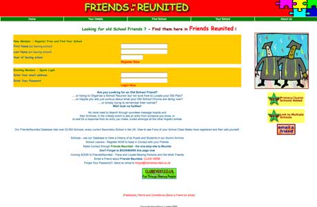
17. friendsreunited.com – launched in 2000
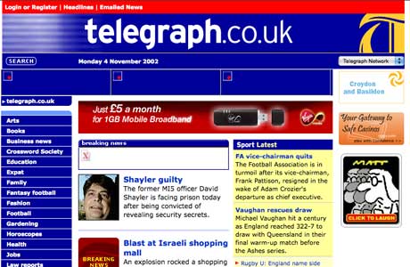
18. telegraph.co.uk – launched in 1994
19. blogger.com – launched in 1999

20. flickr.com – launched in 2004

Craig’s List doesn’t need the Wayback tool because he refuses to change anything.
I didn’t know Facebook was TheFaceBook. Sounds like McCain talking teh Internets.
haha Amazon.com and Craigslist.com haven’t changed much at all!
I LOVE the Dell one
The most hilarious thing today: the cash for gold add goggle put on your site. LMFAO
you are so observant im used to ignoring ads, thats ballsy after yesterdays post
Fantastic list. Dell looks like a gaming site, Wikipedia looks obnoxious, White House website was then managed by George W. Bush hence it sucked! 😀
This is a cool list. Enjoyed reading it.
religion LOL
very weird how things change…..i cant
belive how myspace,fAcebook,and twitter
use to look like that.sooo weird
Oops…White House in 94 was Slick Willie.