Written by Owen Javellana
Hollywood is a place of long-standing tradition, of history, of precedent and of practice. Here are some practices that suck. Honorable mentions include “Letting Natasha Bedingfield Anywhere Near Your Soundtrack.”
1. MAKING VAGUE MOVIE POSTERS
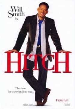
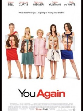
I don’t expect a plot synopsis on a poster. But all marketing logic suggests I should be able to get a vague idea of what the movies about. Yet still, every once in a while you get a poster that tells us next to nothing. The poster for Hitch suggests a plot about Will Smith JUST STANDING THERE. On the opposite side of the spectrum are posters so convoluted that they take 2 minutes of guessing. The poster for You Again requires you to stare at it for two minutes, drawing mental lines to connect each woman to her enemy (I guess?). Looking at posters should not feel like the activities for kids on the back of a cereal box.
2. PUTTING THE DIRECTOR’S NAME EVERYWHERE
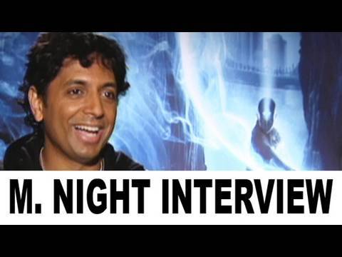
Unless this is the cover of a mystery novel sold at Walgreens, the creator’s name should never be as big as the title of the movie. You can advertise the director, sure, but the movie should sell itself, not just rely on the name and reputation of whoever’s directing it. It may get attention, but it comes off as un-classy, like R&B singers who feel the need to sing their own name as soon as the song starts. Not to mention how this can bite you in the ass when disappointed critics wonder who’s to blame for “Tyler Perry’s Madea Jumps The Shark.”
3. MILKING DVD PROFITS

It’s understandable that studio’s want you to buy their movie. It just gets aggrvating when they want you to buy the same movie over and over again. They’ll release a bare-bones, standard DVD early, with next to nothing in the way of extra features (an audio set-up, some cast bios, and pausing). Then they’ll release a “special edition” a few months later, with the features you would actually want to see. And God help you if you’re a fan of a series, you’ll be buying a new “complete” set every time a new installment comes out.
4. TRAILERS THAT EXPLAIN THE ENTIRE PLOT
This is pretty self-explanatory. For example, this is a trailer for Charlie St. Cloud, which comes off less like a trailer and more like a recap of the first hour and a half of the movie, for someone who arrived really, really late. I personally haven’t seen Charlie St. Cloud, because it’s about Zac Efron playing baseball with a dead little boy (three things I care little about), but… I don’t really need to see it anymore, do I?
5. CGI/LIVE ACTION REMAKES OF OLD CARTOONS
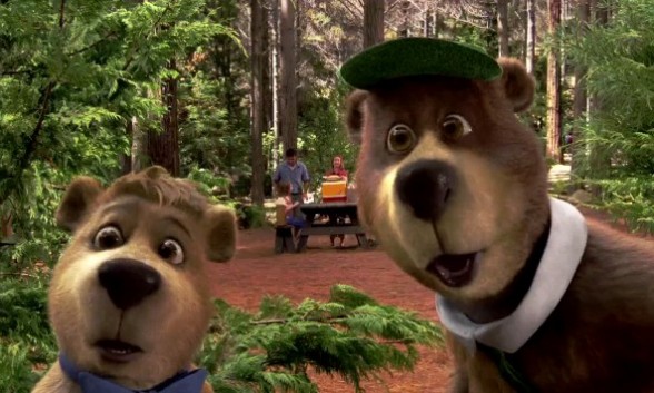
We get it, CGI is advanced now. Gone are the whimsical days of Who Framed Roger Rabbit? and Space Jam, where 2D animation walked side by side with Michael Jordan. Nowadays, computer animation is able to make these once-beloved characters juuuust realistic enough to be absolutely creepy. With the upcoming adaptations of Yogi Bear (2010) and The Smurfs (2011), children who have never seen a single episode of the cartoons can now look forward to seeing them in their nightmares.
6. WEBSITES BASED AROUND A QUESTION
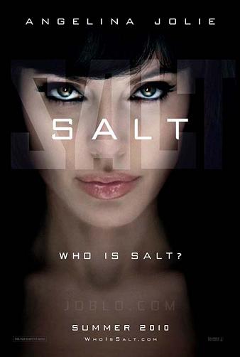
In 1999, when The Matrix was being promoted (yes, it was that long ago), the website was whatisthematrix.com. This worked back then because A.) it was one of the first times, and B.) it made sense with the plot, which was centered around discovering what the Matrix was. Nowadays, it’s a just a cheap way to ask people to be curious about your movie. Who is Salt(.com)? Who are the Takers(.com)? Does the Sisterhood travel, or just the Pants(.com)?
Incidentally, after watching Takers, I no longer care in the slightest who they are.
7. PARODY MOVIES
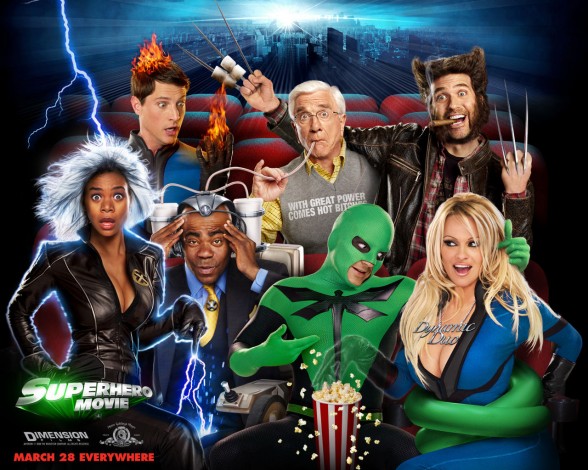
This year, we will have the joy of seeing Not Another Not Another Movie. I’m not joking. A parody about parodies. We have scraped the bottom of the barrel so hard, we have tunneled through to the top of a barrel in China.
8. “RACEBENDING”
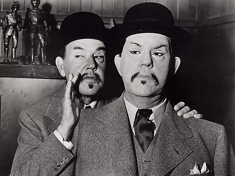
Giving roles meant for racial minorities to white actors and actresses is nothing new. Hollywood has done it with animated characters (The Last Airbender), real life figures (21), and now historical figures, with the upcoming Ghengis Khan film starring the decidedly un-Mongolian Mickey Rourke. I won’t get into the politics of it right now, but everytime Hollywood does this I feel like they’ve lined up every minority’s face perfectly, so they could run down the line and slap each one, like a pro-wrestler giving high fives to the crowd.
9. POST-PRODUCTION 3D

People are split on 3D. Some people love it. Personally, I forget it’s there after 4 minutes. But one thing people can agree on: If you tack on 3D effects after you’ve wrapped instead of filming in 3D from the beginning, every one hates you. It’s like how junk food adds high-fructose corn syrup. I’m sure it’s cost effective and profitable to put in your product, but there’s still a general understanding by the consumer that it’s the worst thing ever.
10. GIVING PAUL WALKER LINES WITH STREET SLANG
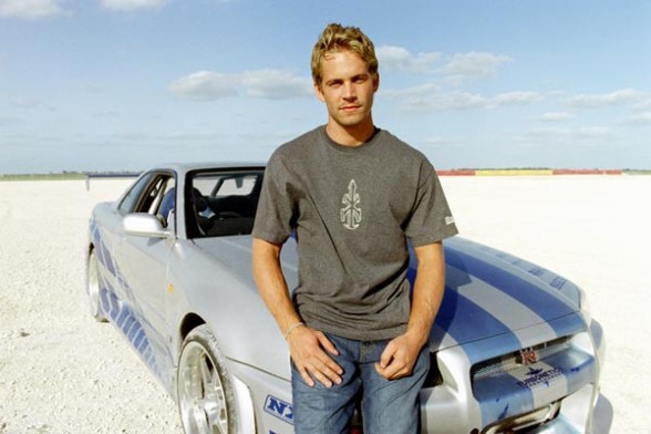
Paul Walker has the personality of an Ikea coffee table and the street cred of an Ikea coffee table. Casting him alongside Tyrese or T.I. only highlights this fact. He can’t even pull off saying the line, “My pockets ain’t empty, bro,” in 2 Fast 2 Furious. Even dorky white guys can say “bro.” But once again, Walker defies all convention.
Bonus: Happy first day of Autumn
